Mobile shopping is popular
Mobile shopping is becoming increasingly popular, and selling goods and services via apps is today big business. But what does it really take to be successful? How do you increase your conversion rate? You can often find the answer in the checkout.
If you run a mobile app, you’ve probably experienced the following scenario (a little too) many times: The customer fills up their shopping cart, clicks on to the checkout happy and satisfied– and then jumps off and disappears. What went wrong? Where did the customer go? Although the experience can be confusing, the explanation is usually simple: Most likely, your payment solution is not seamless enough, and then customers become impatient. So what can you do about it? Here are our best tips.

Know your customers
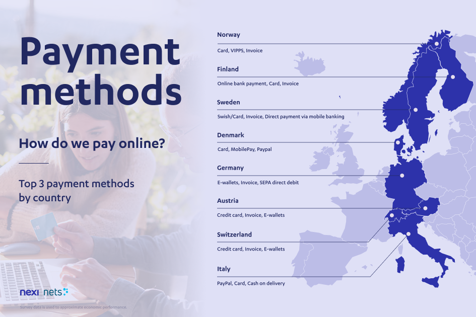
To increase the conversion rate in your app, you first need to get to know your customers better. Find out how they prefer to pay, and which methods they feel confident with– and design the payment process accordingly. Only here in the Nordic countries are there major differences when it comes to payment preferences: While Norwegians, Swedes, and Danes prefer to pay by card, Finns prefer to pay via online banking.
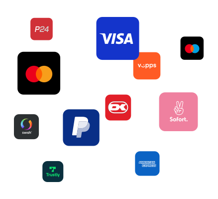
At the same time, we clearly see that the mobile payment solutions— such as Vipps, Swish, and MobilePay— are becoming increasingly popular in all the Nordic countries, both on desktop and in apps. If you want to sell more, you should therefore start by mapping the customers’ preferences and habits and ensure that the payment process meets their expectations.

Data and information needs
Quick registration of card details
Quick and easy registration of card details proves to be decisive for whether a customer completes the transaction or not. One of the main reasons why a customer cancels a purchase is precisely because the process was not efficient or easy enough. By using, for example, a card scanner, your customers do not have to enter the card information themselves and save a lot of time. But also be aware of the following pitfall: If the customer’s payment card has a special design (for example, that the card number is divided), the scanner will not be able to read it. It is therefore important that you also offer manual registration.
Storage of payment information
One thing customers like even better than quick registration is no registration at all. Solutions that remember the user and payment information from time to time, such as Apple Pay and Nets Easy, are super popular. Such solutions, where customers can often pay with a single keystroke, are perhaps the fastest forms of payment, without compromising the customers’ security. Although we know that many people still haven’t turned to these payment methods, we can clearly see that their popularity has increased – and that it will only continue to increase.

Ensure a seamless payment process
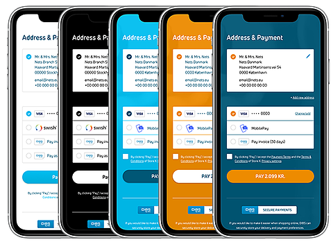
A seamless payment process is about several things— including automatic navigation between different applications, or so-called automated app switching. If your customers have to order in one app, pay in another, and confirm in a third, the chance that they will run away increases. Design is also important to give customers the feeling of a seamless buying experience. Make sure to keep the company’s visual profile throughout the process, so that customers always recognize themselves and thus feel confident in who they are shopping with.
For a payment process to be experienced as seamless, it must also be simple. When you know that your customers shop on their mobile and therefore only have one free hand, you should also offer payment methods that can be completed with, yes, one hand – such as Vipps, Swish or MobilePay.

Don't confuse the customer
It may sound obvious, but there are still a surprising number of people who end up losing customers, simply because of confusion at the checkout. A typical example of this is offering the wrong keyboard: If you, as a customer, enter your card number, but get a keyboard with only letters, it is not strange if you say thank you and move on to another online store. Also, make sure you don’t confuse customers by offering too many payment options – forget about quantity, and instead focus on quality. In other words, make sure you know which payment methods your shoppers prefer (which brings us back to the first point about knowing your customers).

Anders Knudsen
Head of Product Management, Group eCom
Anders has worked for 15 years in e-commerce and describes himself as an "e-commerce nerd" who loves to play with all kinds of e-commerce solutions.
- Topics


