Contributors

With 15+ years of experience in strategic marketing and communications roles, for Nets I focus on presenting e-commerce market insights in a way that is easy to understand and practical.
Share this post

Contact sales
Our turnover increased by 21.5%. Additionally, we have 28% more transactions – and 49% more orders from mobile.
Customer storyJon-Inge Heldal
CEO Parkett.no
Our conversion rate increased from three to four percent, a very big change that resulted in an increase in completed purchases by 30%.
Customer story
Per Erik Kirkaune
Marketing Manager at Norsk Bildelsenter
Previous payment solutions have given us lots of manual work. We had to log into several portals to manage transactions, and there was much fraud. With Nets Easy none of that is an issue anymore.
Cecilie Ciekals
Performance Marketing
Manager at Lampehuset
FAQ
We get it, you have questions. We have answers. Check out our most frequently asked questions and if you can’t find the answer there, please contact support. Our local offices are open 24/7, they’ll be able to help you out right away.
Is there a live demo I can test?
Yes. There is a demo store at shop.easy.nets.eu where you can try Easy Checkout and change numerous settings to see how to customize the checkout flow. Use any of the sample credit cards to test card processing, or use a sample invoice address to test invoice processing. You can also create a free test account to access Easy Portal.
How do I update my company information?
If you want to update the address or name, you can contact our Support team. If the changes concern your company registration number, please contact our sales department so that we can help you out with a new application. Contact information can be found at the top of the support page.
Where can I find my merchant number (merchant ID)?
Your merchant number (also known as merchant ID) can be found in Easy Portal and is displayed at the top of the page. A merchant number can only contain digits.
Which payment methods does Nets Easy support?
We offer local payment methods in different countries. We continuously work to add new payment methods. Read more about the payment methods supported in your regions.
LEARN
Insights
In our insights section we share knowledge about selling online, consumer insights, payments, market trends, and much more. You can also find posts from our guest writers on subjects ranging from SEO to inventory management.

Ecommerce Report 2023 Europe
Are online shopping different accross Europe similiar or different? Dive into our comprehensive Ecommerce Report 2023 Europe to uncover valuable insights into European consumer behavior and preferences.
Read article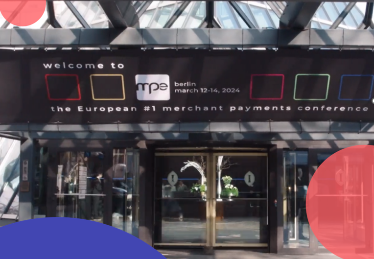
Nexi Roadshow Berlin: Insights from the MPE Conference
The Nexi Roadshow stopped by the MPE Conference. Here is a behind-the-scenes, uncovering the latest trends in the payment industry (and exciting information about developments in the DACH region).
Read article
With digital payment, Norway's Foody achieves growth and satisfied customers
Foody's getFOOD app enables mobile ordering of food and drink in Norway- increasing sales and simplifying logistics for restaurants. The simple online payment solution from Nets makes convenience possible.
Read article